On Brand | Connecting Creative Instinct with Design Theory
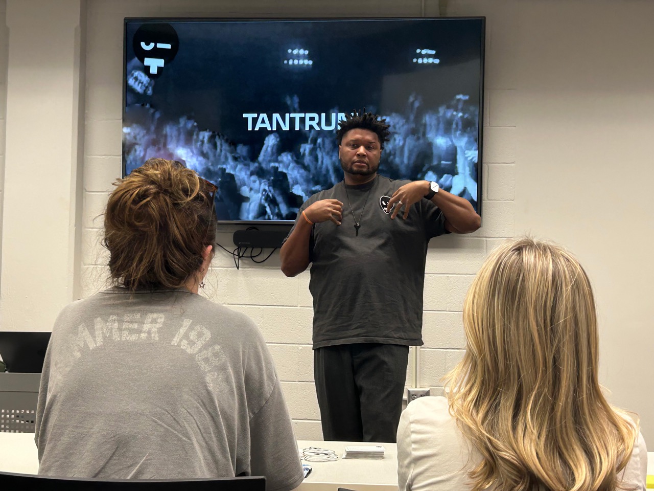
A few weeks ago, I invited David to speak to a few classes at my alma mater, Auburn University. During a guest lecture in an Aesthetic Theory class I was actually enrolled in, he said something that felt intuitive in thought, automatic in practice, but surprisingly complex in theory.
“Emotion is what connects a campaign to an audience.”
It’s a simple statement, but it carries a lot of weight. David has spent decades working across brands and categories. In fact, we met in a work setting; so, his perspective comes from real experience. What’s interesting, though, is that his instincts line up closely with what design theory has been saying for years.
Think about it. We’ve all had that moment where a commercial, product, or even just an image instantly clicks with us. You feel something right away, even if you can’t explain why. That reaction is common, but most people don’t really think about what’s happening underneath the surface.
As a PhD student in Consumer and Design Sciences at Auburn, I spend a lot of time digging into exactly that. What actually makes something resonate? Why are we drawn to certain logos, products, or visuals over others? Researchers have explored ideas like optimal arousal, processing fluency, and the pleasure–interest model to help explain what initially draws us in, and what keeps our attention.
Here’s the thing. As humans, we tend to react emotionally first. Before we analyze or assign meaning, we’ve already decided, at some level, whether we like something or not. That means a brand, a logo, or even a social media post has a very small window to make a strong first impression.
And that first impression? It usually comes down to whether the design feels “right.”
We’ve all heard the phrase “beauty is in the eye of the beholder,” but there are actually some shared patterns in what people tend to prefer. In general, we’re drawn to things that feel clear, organized, and balanced. Designs that are easy to process tend to feel better to us. They just make sense.
But here’s where it gets tricky.
If something is too simple, we get bored. If it’s too complex, we get overwhelmed. Most of us are looking for something in the middle, what’s been called "optimal arousal" or "the aesthetic middle." That something that feels smooth and easy, but still interesting enough to hold our attention. That balance is where good design really lives.
However, a cool design alone isn’t enough to create a deep connection or turn someone into a loyalist. It gets you in the door, but it doesn’t necessarily make people stay. The deeper, more thoughtful connection comes from meaning, symbolism, and relevance to the person experiencing it. And that part isn’t universal. What resonates with one person might not resonate with another. Our preferences are shaped by culture, values, background, familiarity, and our own experiences with design. That’s why it’s so important for brands to truly understand their audience. What feels “right” to one group might completely miss the mark with another.
So in the end, design does two things.
It catches your eye, and if it’s done well, it opens the door. But it’s the personal meaning behind it that really sticks with you.
Design may get your attention, but meaning is what touches the soul. Emotion creates the initial connection, but compatibility is what sustains the relationship. Cracking that balance is what turns good design into a lasting brand experience.
Written by Phillip Sidberry,Tantrum's Creative-in-Residence